Hướng Dẫn Tạo Một Đồng Hồ Kỹ Thuật Số


Giới Thiệu Chung
Hôm nay mình sẽ giới thiệu các bạn làm một đồng hồ kĩ thuật số viết bằng HTML,CSS và Javascript.
Mục đích của bài viết này là giúp các bạn ôn lại các kiến thức đã học cũng như tự chính tay mình làm ra một project nho nhỏ dùng để xem giờ. Hẳn là các bạn newbie rất thích đúng không vậy thì chúng ta bắt tay vào làm thôi nào.
Bắt Tay Vào Code Thôi Nào
Lên Ý Tưởng
Chúng ta sẽ tạo thành 6 con số. Trong đó mỗi số sẽ có 7 đoạn thẳng ghép với nhau. Thì sẽ tạo ra 7 số. Trong đó hai số đầu là giờ, hai sô tiếp theo là phút và hai số còn lại là giây. Các bạn hình dung ra được mình sẽ code những gì chưa. Chúng ta bắt tay vào code thôi nào.
Code HTML
Thì chúng ta code 6 số trong mỗi sô ta code 7 line. Cái này cũng đơn giản.
<html>
<head>
<meta charset="utf8" />
 <title>Digital-Clock</title>
 <link rel="stylesheet" href="css/style.css"/>
</head>
<body>
<div class='time' id="time" data-hours="" data-minutes="">
<!-- digit1  -->
<div class="digit">
<div class="line"></div>
<div class="line"></div>
<div class="line"></div>
<div class="line"></div>
<div class="line"></div>
<div class="line"></div>
<div class="line"></div>
</div>
<!-- digit2  -->
<div class="digit">
<div class="line"></div>
<div class="line"></div>
<div class="line"></div>
<div class="line"></div>
<div class="line"></div>
<div class="line"></div>
<div class="line"></div>
</div>
<!-- digit3  -->
<div class="digit">
<div class="line"></div>
<div class="line"></div>
<div class="line"></div>
<div class="line"></div>
<div class="line"></div>
<div class="line"></div>
<div class="line"></div>
</div>
<!-- digit4  -->
<div class="digit">
<div class="line"></div>
<div class="line"></div>
<div class="line"></div>
<div class="line"></div>
<div class="line"></div>
<div class="line"></div>
<div class="line"></div>
</div>
<!-- digit5  -->
<div class="digit">
<div class="line"></div>
<div class="line"></div>
<div class="line"></div>
<div class="line"></div>
<div class="line"></div>
<div class="line"></div>
<div class="line"></div>
</div>
<!-- digit6  -->
<div class="digit">
<div class="line"></div>
<div class="line"></div>
<div class="line"></div>
<div class="line"></div>
<div class="line"></div>
<div class="line"></div>
<div class="line"></div>
</div>
</body>
</html>
Chúng ta mở trình duyệt lên thì chúng ta sẽ thấy chưa có gì hiện lên hết. Giờ ta bắt đầu code CSS thôi lào.
Code CSS
Bạn code CSS để tạo tạo thành các line bằng cách sự dụng before và after. Trong bài này chúng ta sẽ sử dụng nhiều về before, after và nth-child(n), transform,...Đó là những thuộc tính vô cùng quan trọng đi với bạn suốt cuộc đời web developer.
Bạn code cho mình như thế này nhé:
body,html{
	padding:0;
	margin:0;
	width: 100%;
  height: 100%;
}
*,*:before,*:after{
	position:relative;
	box-sizing:border-box;
}
*:before,*:after{
	content:'';
	display:block;
}
*{
	transform-style:preserve-3d;
	perspective:1000px;
}
body{
	display:flex;
	justify-content:center;
	align-items: center;
	transform-style:preserve-3d;
	perspective:1000px;
	background-color:#121212;
}
.time .digit{
	transform-style:preserve-3d;
	margin: 0 0.5rem;
	perspective:1000px;
	height: 20vmin;
	width: 10vmin;
}
.line{
	position:absolute;
	transform-style:preserve-3d;
	perspective:1000px;
}
.line:after, .line:before{
	content:'';
	display:block;
	position:absolute;
	color:#E80000;
	background:#fff;
	transition: all 0.9s cubic-bezier(0.5,0,0.5,1);
	border-radius:3px;
	box-shadow:0 0 1rem #E80000, inset 0 0 0.125vmin #E80000;
}
.line:after{
	transition-timing-function: cubic-bezier(0.4,0,0.1,1);
}
/* nth-child(odd) là lựa chọn các line lẻ */
.line:nth-child(odd){
	height:50%;
	width:0.5vmin;
}
.line:nth-child(odd):before, .line:nth-child(odd):after{
	height:calc(50% - 0.25vmin);
    width:100%;
}
.line:nth-child(odd):before{
	top:0.25vmin;
transform-origin:center top;
}
.line:nth-child(odd):after{
	bottom:0.25vmin;
transform-origin:center bottom;
}
/* nth-child(even) là lựa chọn các line chẳn */
 .line:nth-child(even){
	 width:200%;
	 height:0.5vmin;
 }
 .line:nth-child(even):before, .line:nth-child(even):after{
	width:calc(50% - 0.25vmin);
     height:100%;
}
 .line:nth-child(even):before{
	 left:0.25vmin;
transform-origin:left center;
 }
.line:nth-child(even):before{
 left:0.25vmin;
 transform-origin:left center;
 }
.line:nth-child(even):before{
 right:0.25vmin;
 transform-origin:right center;
}
Các bạn xem thử nó sẽ hiển thị cái gì nha:

Các bạn sẽ thấy nó sẽ xuất hiện các thanh line. Thì tiếp đến chúng ta sẽ làm thế nào đó di chuyển các thanh line thành các số.
Các bạn sử dụng các thuộc tính top, left, right, bottom, hover và flex để làm phần này nha.
Các bạn code theo mình:
.line:nth-child(1){
	 top:0;
	left:0;
}
.line:nth-child(2){
	top:0;
	 left:0;
 }.line:nth-child(3){
	 top:0;
	right:0;
}
.line:nth-child(4){
	 top:50%;
	left:0;
 }
 .line:nth-child(5){
	top:50%;
	 left:0;
 }
 .line:nth-child(6){
    bottom:0;
   left:0;
}
.line:nth-child(7){
	 top:50%;
	right:0;
}
 .time{
	 display:flex;
	 flex-direction:row;
	transition: translateZ(20px);
	transform: translateZ(20px) rotateX(calc(0*45deg))
	 rotateY(calc(0*45deg));
 }
 .digit:nth-child(2),.digit:nth-child(4){
	margin-right:4vmax;
}
 .digit:nth-child(2):before,.digit:nth-child(2):after,
.digit:nth-child(4):before,.digit:nth-child(4):after{
	 content:'';
	 background:#fff;
	display:block;
	 position:absolute;
	 text-align:center;
	 width:1vmax;
	 height:1vmax;
	 left:calc(100% + 2vmax);
	 text-shadow: 0 0 1rem #E80000;
	 font-size:80px;
	 box-shadow:0 0 1rem #E80000, inset 0 0 0.125vmin #E80000;
     animation: pluse 1s alternate cubic-bezier(0.5,0,0.5,1);
	}
 .digit:nth-child(2):before,.digit:nth-child(4):before{
	 top:30%;
 }
.digit:nth-child(2):after,.digit:nth-child(4):after{
	 bottom:19%;
 }
 @keyframes pluse{
	 to{opacity:0.5}
 }
.digit:hover{
	 transform: translateZ(2vmax);
 }
.digit:hover:after,
.digit:hover:before{
	transform: translateZ(-2vmax);
}
Các bạn xem nó hiển thị như thế nào khi ta thêm dòng code trên nha:

Công việc tiếp theo mà mình làm đó là làm cho cái đồng hồ đó hoạt động đúng không nào. Trong một lần sử dụng facebook, thì mình tình cờ tìm thấy một thư viện về cái này.
Các bạn có thể code thuần bằng JS nhưng mà mình muốn thử nghiệm một cách mới mẻ nên mình dùng cái này.
Các bạn download file CSS tại đây
Các bạn download file JS tại đây
Các bạn download về sau đó giải nén ra bỏ vào thư mục libs nha.

Trong file index.html bạn tạo đường dẫn các file css vào bên trong thẻ head nha:
 <link rel="stylesheet" href="libs/css/GoingToInternet.css"/>
  <link rel="stylesheet" href="libs/css/normalize.min.css"/>

Cũng tương tự như cách dẫn file css thì cách dẫn file js bạn để trước thẻ đóng của thẻ body.
<!-- link script -->
<script src="libs/js/Rx.min.js"></script>
<script src="libs/js/hammer.min.js"></script>
<script src="libs/js/rxcss.min.js"></script>
<script src="libs/js/GoingToInternet.js"></script>

Sau khi các bạn làm xong các bước trên các bạn reload lại trình duyệt xem nó hoạt động như thế nào nha.
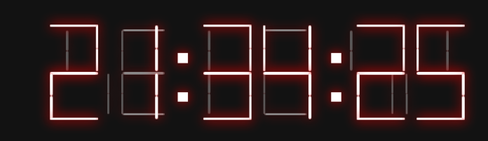
Các bạn vào link project mà mình deploy lên firebase nha tại đây. Mình sẽ có bài hướng dẫn deploy web tĩnh lên firebase.
Lời Kết
Vậy Là Xong topic Hướng Dẫn Tạo Một Đồng Hồ Kỹ Thuật Số rồi nhé. Các bạn tự code và xem kết quả nhé, các bạn tự code lại để ôn lại và nắm vững các kiến thức hơn nha.
Nếu mọi người cảm thấy bài viết này hay thì có thể ủng hộ mình để mình có động lực để ra những bài topic hay và chất lượng hơn ủng hộ mình tại đây nha.
Chúc Các Bạn Thành Công!!